and yet nothing is
done blindly, hastily, or
indifferently
I am getting into the history of the low country where I now find myself living.
The low country is the southern point of the State of South Carolina where the elevation above sea level is 20 feet or less, hence the name, low country.
You don’t have to be here very long to learn that the greatest natural disaster to hit the area was the Sea Islands Hurricane of 1893.
I had never heard about.
Not too many people outside of the area have heard about it.
That was also one of the major problems that the surviving residents of the hurricane experienced.
No one knew about it.
Few people outside of the area were aware of the impact of the storm in this part of the country.
Savannah was the point of landfall and Savannah had some damage but Savannah is somewhat inland.
The barrier or Sea Islands were almost wiped off the map.
Modern interpretation of data shows that the storm surge along the South Carolina-Georgia Coast may have been as high as 30 feet.
And there was little in the way of communication with the area to get the word out.
Most of what historical information there is are estimates.
There were an estimated 30,000 people living on the Sea Islands.
After the Civil War, this area was also over 90% black and former slaves.
Over 2,000 people may have died, most by drowning.
That makes the Sea Islands Hurricane the 4th most deadly hurricane in recorded US history.
For the most part, the surviving 28,000 people were left homeless.
That is 100% folks.
On top of no shelter there was no food, no supplies and all fresh water sources of inland lakes, ponds and springs had been filled with salt water.
And few people knew.
There were no cell phones, no CNN, no power boats, no bridges, no national guard, no communication of any kind.
Word did not get for days.
Relief did not reach the area for weeks
Real relief did not reach the area for months.
Took time to get the word out.
When national relief came it came from the 10 year old American Red Cross.
The American Red Cross was set up in 1881 by Clarissa Harlowe Barton.
Better known just Clara Barton, she worked to establish the Red Cross as a non-profit humanitarian organization that provided emergency assistance, disaster relief, and disaster preparedness education in the United States. (wikipedia)
Ms. Barton first entered the national stage during the Civil War where she was active in providing clothing, food, and supplies for the sick and wounded soldiers.
Now she was boss of the Red Cross and she took her new organization down to the low country.
How in the world did this happen?
Turns out the during the Civil War years, Ms. Barton had stationed herself on Hilton Head for a while.
Her brother David had alerted her to the fact that the Union Army was building up forces on Hilton Head of an attack on the Charleston, SC area.
Some of those efforts are portrayed in the movie, Glory.
David Barton himself was stationed here.
From April, 1863 to January, 1864, Ms. Barton was here.
Ms. Barton was involved with sick and wounded solders as well as educating and working with the black islanders who lived here.
Something about this area gets into your blood.
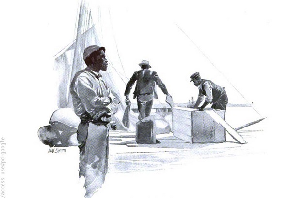
When Ms. Barton heard of the devastation, she moved her office to Beaufort, SC and set up to provide relief in the way of food and medicine the best they could.
The Red Cross stayed here and handed out food and other supplies to survivors.
Folks had heard about this new American Red Cross and weren’t quite sure what is was or what it could do.
The Atlanta Newspapers sent reporters to cover the story.
Back then, Newspaper folks knew that the story was more than names, dates and facts and that the story might require something more than just a reporter.
So Joel Chandler Harris was sent down to write the story.
This is not the place to get into a Joel Chandler Harris discussion but suffice to say, the feller could write.
His efforts were published in two parts in Scribner’s Magazine.
Scribner’s Magazine in the 1890’s was Time, Newsweek, Life and the New Yorker all rolled into one.
The stories were “The Devastation” published in February, 1894 (5 months after the storm) and “The Relief.” published in March, 1894.
At the end of the first story, ‘The Devastation’, Mr. Harris wrote:
I went to the Sea Islands with no prejudice against the Red Cross Society, but certainly with no prepossession in its favor. I had pictured it in my mind as a sort of fussy and contentious affair, running about with a tremendous amount of chatter and flourishing a great deal of red tape — a sort of circumlocution office, situated in the air between individual officiousness and newspaper notoriety.
As a matter of fact, the Red Cross Society as I saw it at Beaufort is something entirely different from any other relief organization that has come under my observation.
Its strongest and most admirable feature is its extreme simplicity. The perfection of its machinery is shown by the apparent absence of all machinery. There are no exhibitions of self-importance. There is no display – no torturous cross examination of applicants – no needless delay. And yet nothing is done blindly, or hastily, or indifferently.
This poor little tribute to Miss Clara Barton I want to pay in heartily seconding her appeal to the benevolence of the whole country carrying out her work on the Sea Islands
Such aid will be more important in the last days of her mission than it was when the sympathies of the public had been touched by the awful story of the disaster that went tingling over the wires on the last days of August.
I guess when and what I have been reading the last year about the bill to save America, the bill to rebuild America and the bill to save our climate the words “here are no exhibitions of self-importance. There is no display – no torturous cross examination of applicants – no needless delay. And yet nothing is done blindly, or hastily, or indifferently” just gets under my skin and make me want to scream.
The fussy and contentious affair, running about with a tremendous amount of chatter and flourishing a great deal of red tape that is Congress makes me want to grab Congress by the throat and bash its head against the wall.
If pro is the opposite of con, what is the opposite of progress?
God help us all.
Here are the two articles from Scribner’s Magazine – 1894.