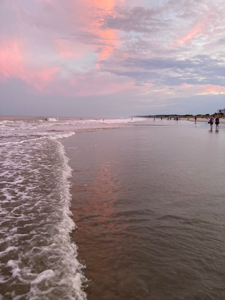
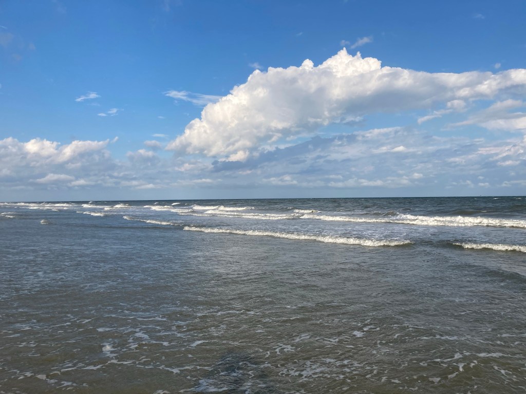
line of horizon disappears into the sky clouds waves reflections
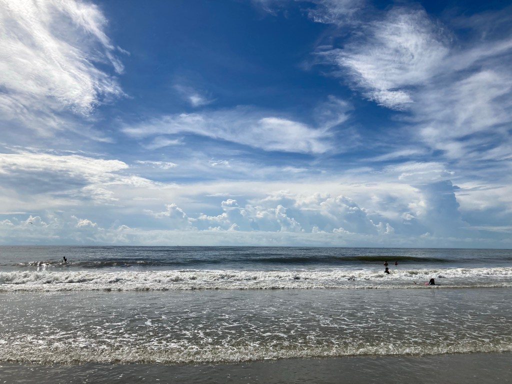
Part of a series based on an afternoon spent at the beach on Hilton Head Island.
I wanted to see if I would be ‘inspired’ by what I saw, by what I heard, by what I smelled, by what I tasted, what I felt emotionally and what I felt tactilely.
Some turned out okay.
Some were too forced.
Some were just bad.
Some did involve some or all of those feelings.
As far as it goes, I guess I was inspired by by what I saw, by what I heard, by what I smelled, by what I tasted, what I felt emotionally and what I felt tactilely.
more blues in blue sky than can ever be counted blue bluer bluest
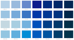
Pantone and the Pantone Color Matching System.
I first heard of it back in 1995 when I was working on the first corporate website I ever launched.
It was the first website for the corporation.
It was a lot of firsts and we were making up the book of rules as we went along.
It was … GREAT!
No rules!
No rules and me?
Bad idea.
Luckily for me and maybe the world, I did come up with one rule for myself that I have held to since this time.
That rule is, “No Horsing Around on the Website.”
Yes, I stole this rule from Dr. Strangelove when Major T. J. “King” Kong, played by Slim Pickins, says, “How many times do I have to tell you boys, I don’t want no horsing around on the airplane.”
It’s one of the few rules I have ever held to and it has saved my career more than once.
Anyway, at that time, the Corporate Branding Team came to meet with me about using the correct logos and fonts and colors on this Web Site.
As for logos, I said, get me a graphic in that new JPEG format and make sure the file is less than 20k and make sure the file extension is jpg as the internet cannot handle a 4 letter file.
For the fonts, I had Arial, Helvetica and Times New Roman.
For the color palette, I had 16 colors and that included black AND white.
The Art Department had the first versions of Adobe and it had 256 colors.
256 colors developed by the Pantone Color Matching System.
According to Pantone, it was all the colors that the human eye could decern.
I used to have one of those early Pantone Color Card Sets which which a set of cards attached at the top left corner of all 256 colors so you could fan out the colors and see how they looked much like the paint color cards you can get a Lowes.
It was years before monitors developed to the point that these colors could be mechanically visually reproduced.
Today the Pantone Color Matching System now lists 2161 colors.
Of those 2161 colors there are some 238 versions of blue.
These colors were identified, developed or created through years of lab work and research.
Pantone admits that some of the differences MAY NOT BE visible to human eye.
I want to ask WHY but I have been in too many meetings where someone has looked at logo or webpage and said, “I don’t know, maybe if it was just a shade more ultramarine … know what I mean?”
I say, “You Bet” and change the color from Denim Blue to Ocean Blue and the world goes on.
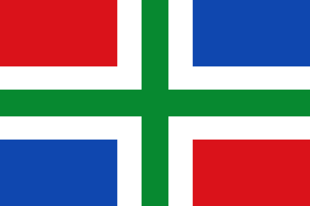
Which brings me to that color, Ocean Blue.
Pantone 300.
In hexidecimal, #006ec7.
A medium dark shade of cyan-blue.
In the RGB color model, #006ec7 is comprised of 0% red, 43.14% green and 78.04% blue.
In the HSL color space, #006ec7 has a hue of 207° (degrees), 100% saturation and 39% lightness.
This color has an approximate wavelength of 475.22 nm.
This color is used in the Groningen flag and Pitcairn Islands flag.
Groningen Flag
That last little factoid cracked me up.
I am one of those genetic freaks with blue eyes.
As the blue eye gene is recessive it seems that over time, no one should have blue eyes.
At this point in time, only 8% of the worlds peoples have blue eyes.
To perpetuate blue eyes you need a tight knit community that doesn’t really like anyone else and pretty much stays grumpy and together by themselves.
You know.
Like Dutch people.
Like the people from Groningen, a province of the Netherlands.
Where my ancestors came from.
Anyway, at the beach, looking out at the water.
Looking out at the sky.
I can see Ocean Blue, Pantone 300 (#006ec7).
I can see all 238 versions of Pantone Blues.
I’ll bet I can see more than 238 versions of blue.
Much like the old joke, What was the largest island in the world before Greenland was discovered? – the answer is Greenland – just because it wasn’t discovered doesn’t mean it wasn’t there.
All these colors were there before Pantone.
All these colors existed before they were registered by Pantone.
That Pantone HAS registered these colors and prevents some users from using them reminds me of the story of Winston Churchill and Charlie Chaplin.
Mr. Churchill asked Mr. Chaplin if he was planning any new roles to play.
Mr. Chapin said, “Yes, Jesus Christ.”
“Have you cleared the rights?”, asked Mr. Churchill.
Color.
Colors.
Talk to me about your fall colors.
Tell me about your reds and golds and yellows.
I’ll take my blues.
A color.
A music.
A feeling.
These things happen daily, but by accident?
Just happy to be here to watch the show.
Part of a series based on an afternoon spent at the beach on Hilton Head Island.
I wanted to see if I would be ‘inspired’ by what I saw, by what I heard, by what I smelled, by what I tasted, what I felt emotionally and what I felt tactilely.
Some turned out okay.
Some were too forced.
Some were just bad.
Some did involve some or all of those feelings.
As far as it goes, I guess I was inspired by by what I saw, by what I heard, by what I smelled, by what I tasted, what I felt emotionally and what I felt tactilely.
vulnerable to commonsensical scorn of those who seek little
I like to quote whoever first said it that common sense is pretty uncommon.
I like to think there is such a thing as common sense.
I like to think that common sense has a common denominator.
I like to think that common sense means the same thing to all people.
I have to realize a new and a new over and over again, that what is common sense to me may be alien political dogma to another.
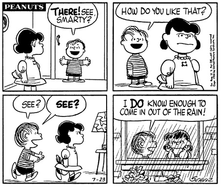
I don’t know when I first read the above Charlie Brown comic strip.
I do know I thought it was really funny.
After I read this I loved being inside when it rained and yelling to the world at large, “See? See? See?”
Not saying that it was thought that I had little common sense or not enough sense to come in out of the rain.
Never once did I have anyone tell me that, “It’s not raining” or “That’s not rain” or “that rain is fake.”
There were some things that were accepted.
Today?
Today everything is on the table.
Today everything is open for discussion.
Today everything is … well … you get the picture.
Everything includes common sense.
Reading from the excerpt, “leave ourselves more than usually vulnerable to the commonsensical scorn of those who seek little.”
Mr. de Botton is writing about, of all things, a light switch on the wall.
Its a string of words that describe the last decade better than book I have come across.
Adapted from the book, The Architecture of Happiness (2009, Vintage Books) by Alain de Botton, and the passage:
We will, of course, run a risk if we spend extended periods analysing the meanings that emanate from practical objects. To be preoccupied with deciphering the message encoded in a light switch or a tap is to leave ourselves more than usually vulnerable to the commonsensical scorn of those who seek little from such fittings beyond a means of illuminating their bedroom or rinsing their teeth.
According the The New York Review of Books, this is “A perceptive, thoughtful, original, and richly illustrated exercise in the dramatic personification of buildings of all sorts.”
What I find irrestible in reading Mr. de Botton is his use of language.
I get the feeling that if you made a spread sheet of all the words, adverbs and adjectives used by Mr. de Botton, you just might find that he used each word just once.
beach breeze breezily breezes across the beaches breezy beachy days
I grew up in West Michigan.
The beaches of Lake Michigan were not far away and I was there often.
For as much time that I spent there, I cannot say that the pleasures of a warm breeze off the water happened often.
Warm water at the beaches of Lake Michigan at the height of summer meant water around 70 degrees.
Any further out, the water stayed around 60.
With a breeze off the water, you tried to lay as flat as you could on your beach towel to get out of the wind.
Now living in South Carolina coast, the warm breeze off the Atlantic Ocean is a wonder.
And this was in October.
Part of a series based on an afternoon spent at the beach on Hilton Head Island.
I wanted to see if I would be ‘inspired’ by what I saw, by what I heard, by what I smelled, by what I tasted, what I felt emotionally and what I felt tactilely.
Some turned out okay.
Some were too forced.
Some were just bad.
Some did involve some or all of those feelings.
As far as it goes, I guess I was inspired by by what I saw, by what I heard, by what I smelled, by what I tasted, what I felt emotionally and what I felt tactilely.
Once we start to look find no shortage of suggestions forms in our kettles
Adapted from the book, The Architecture of Happiness (2009, Vintage Books) by Alain de Botton, and the passage:
Once we start to look, we will find no shortage of suggestions of living forms in the furniture and houses around us. There are penguins in our water jugs and stout and self-important personages in our kettles, graceful deer in our desks and oxen in our dining-room tables.
According the The New York Review of Books, this is “A perceptive, thoughtful, original, and richly illustrated exercise in the dramatic personification of buildings of all sorts.”
What I find irrestible in reading Mr. de Botton is his use of language.
I get the feeling that if you made a spread sheet of all the words, adverbs and adjectives used by Mr. de Botton, you just might find that he used each word just once.